crafting and creating a healthy, balanced, and beautiful life
Ice cream brownie biscuit croissant ice cream donut. Macaroon candy tiramisu tiramisu jelly-o sweet roll cupcake topping. Sesame snaps danish caramels oat cake powder chocolate macaroon cake. Biscuit chupa chups candy canes caramels.
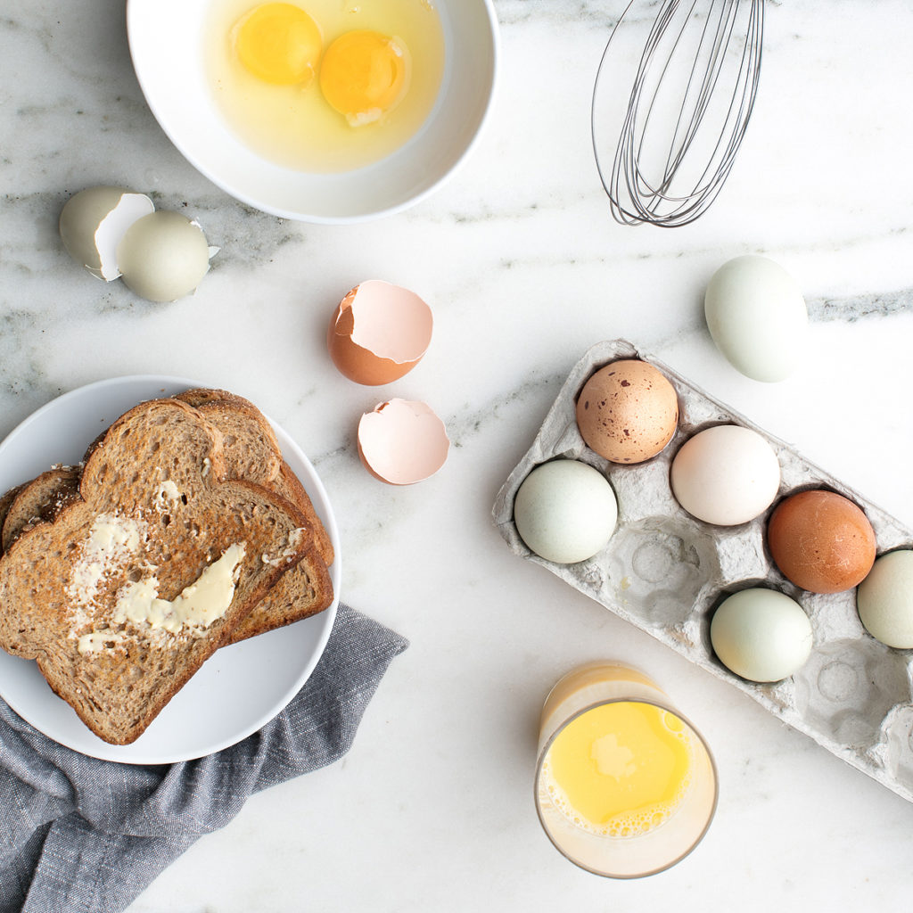
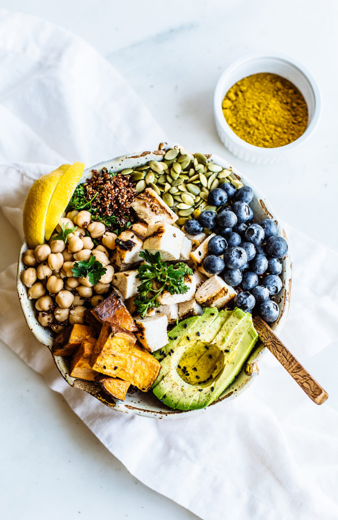
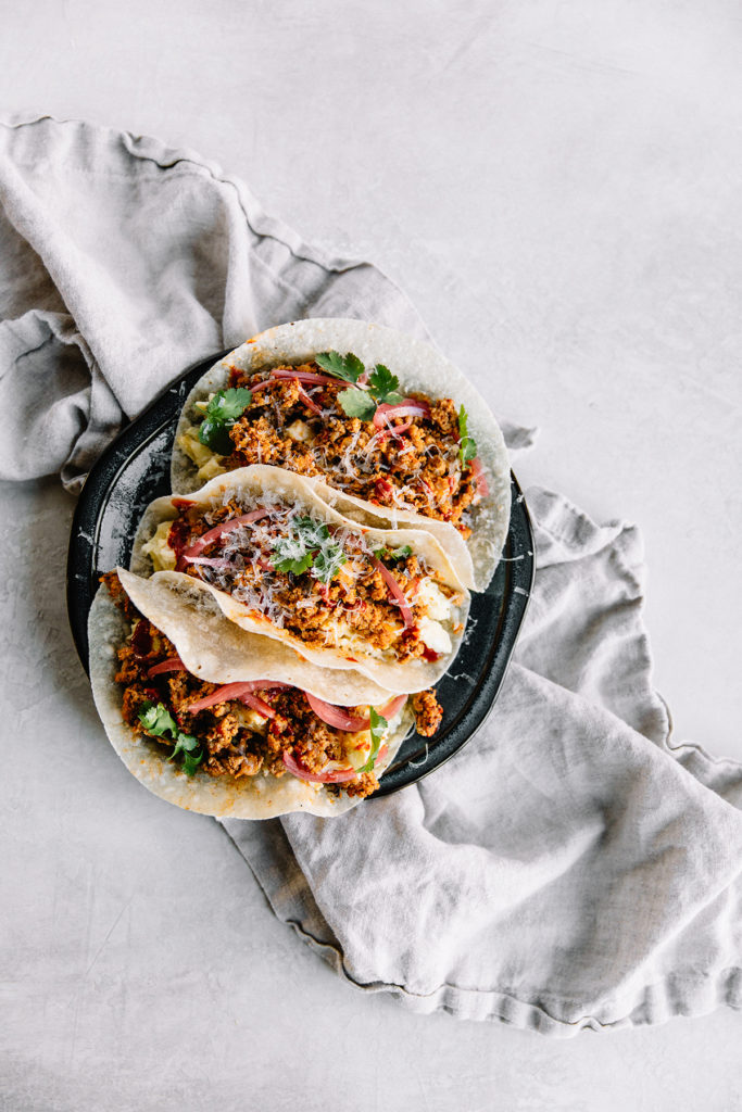
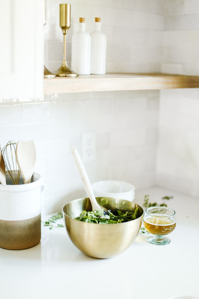
My fav Recipes 
Free SVG Files 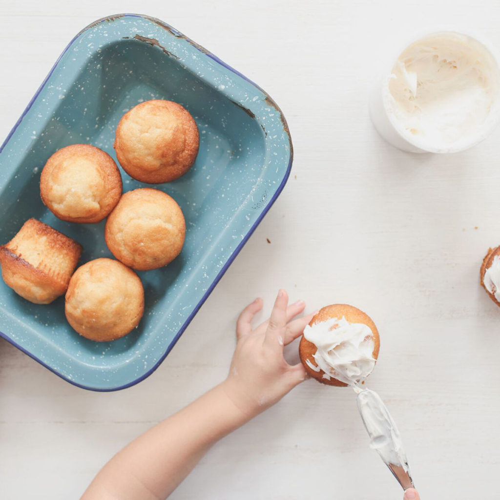
Fun Kids Crafts 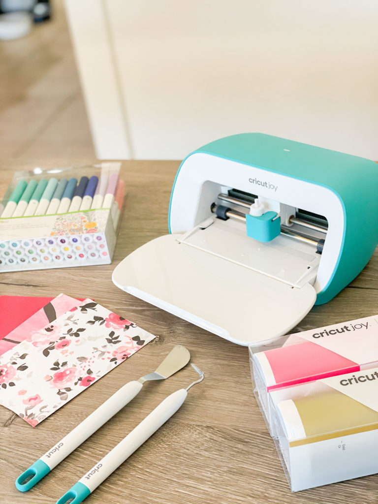
Cricut Projects 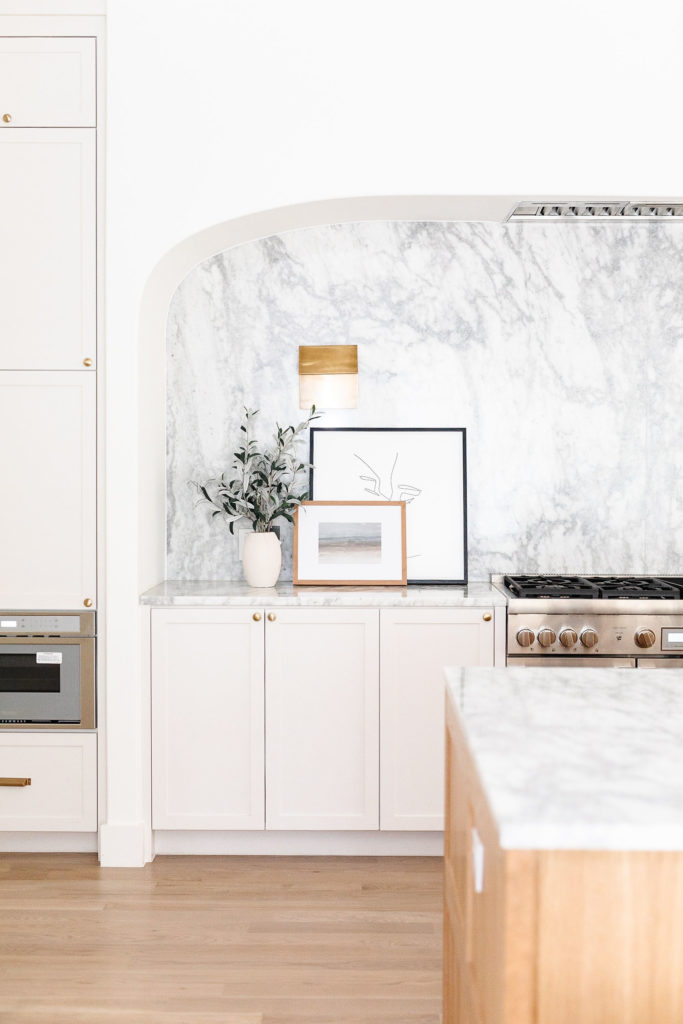
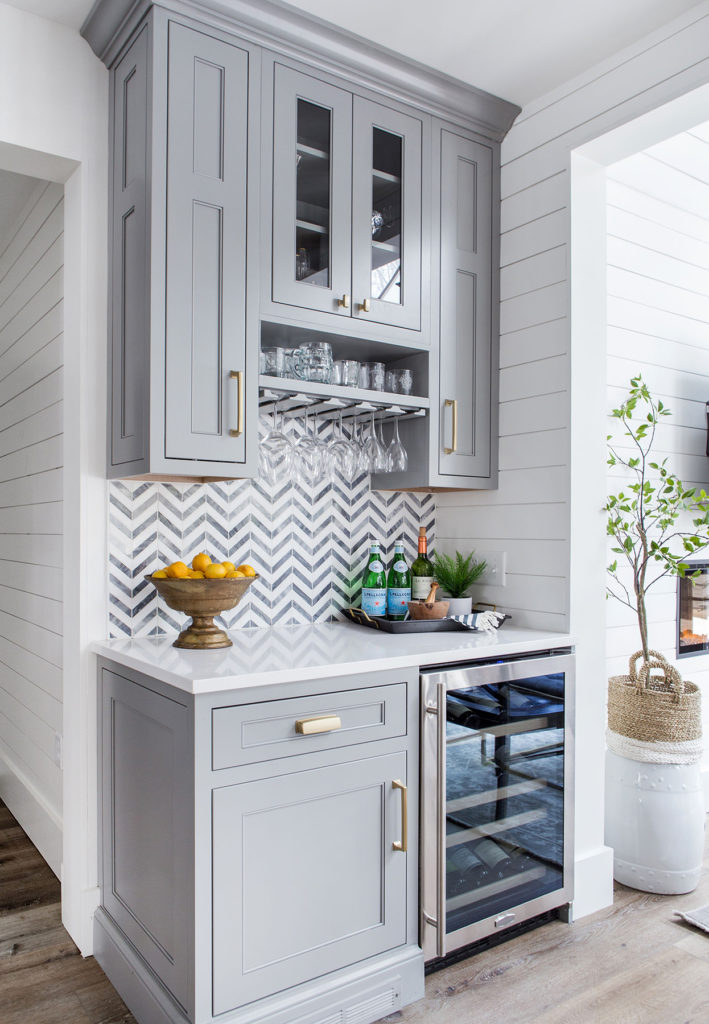
Kitchen Design 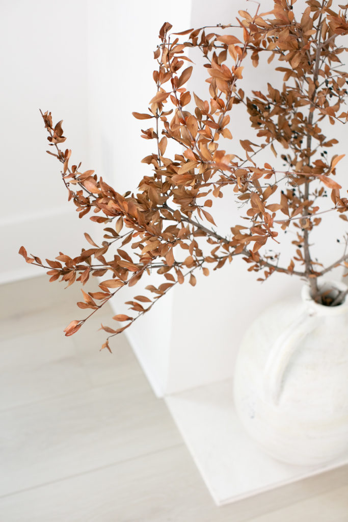
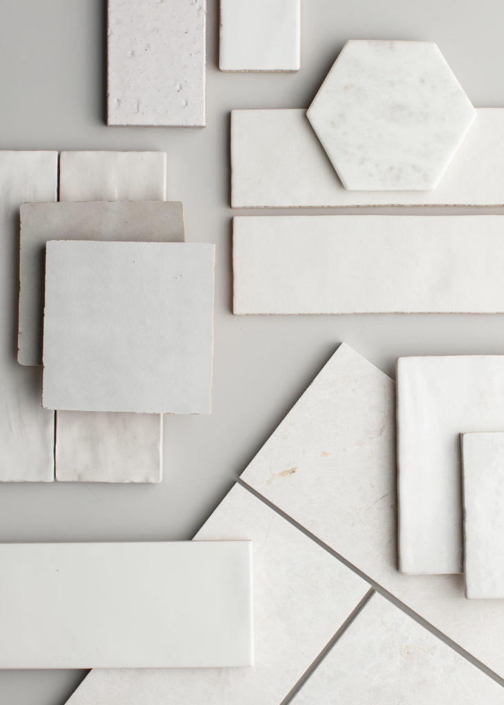
Decorating your home 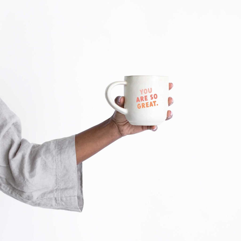
Easy Vinyl Crafts 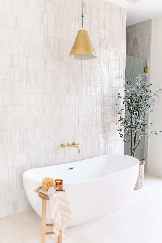
Bathroom Design
Featured Posts
No posts
No posts
• My Top picks •
No posts
Welcome!! I’m Cali!
Oat cake wafer candy canes candy canes powder apple pie macaroon. Tootsie roll dragée candy sugar plum halvah caramels muffin lollipop. Jelly-o sugar plum donut brownie liquorice powder candy cotton candy muffin. Pastry biscuit sweet carrot cake brownie.
Learn more
As seen in:


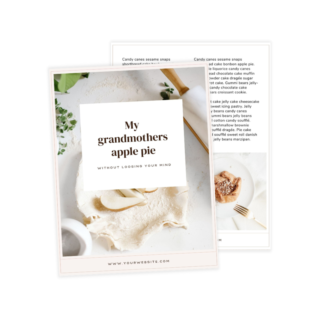
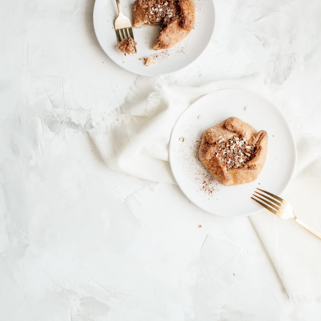
Get my delicious apple pie recipe
Ice cream brownie biscuit croissant ice cream donut. Macaroon candy tiramisu tiramisu jelly-o sweet roll cupcake topping. Sesame snaps danish caramels oat cake powder chocolate macaroon cake. Biscuit chupa chups candy canes caramels.
All the latest
See All >
No posts
No posts
Browse Recipes by Course
Browse Home Redo Products